Dive into the Mind of Heron Preston: Iconoclast, Innovator, Trailblazer
(SPONSORED STORY)
Design
WORDS BY Geoffrey Mak
© HIGHSNOBIETY
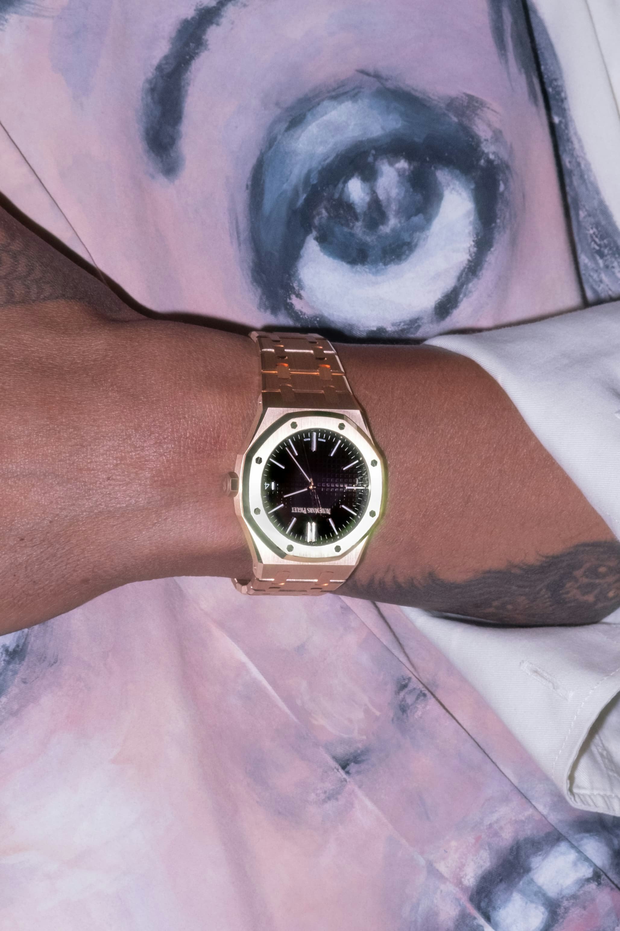
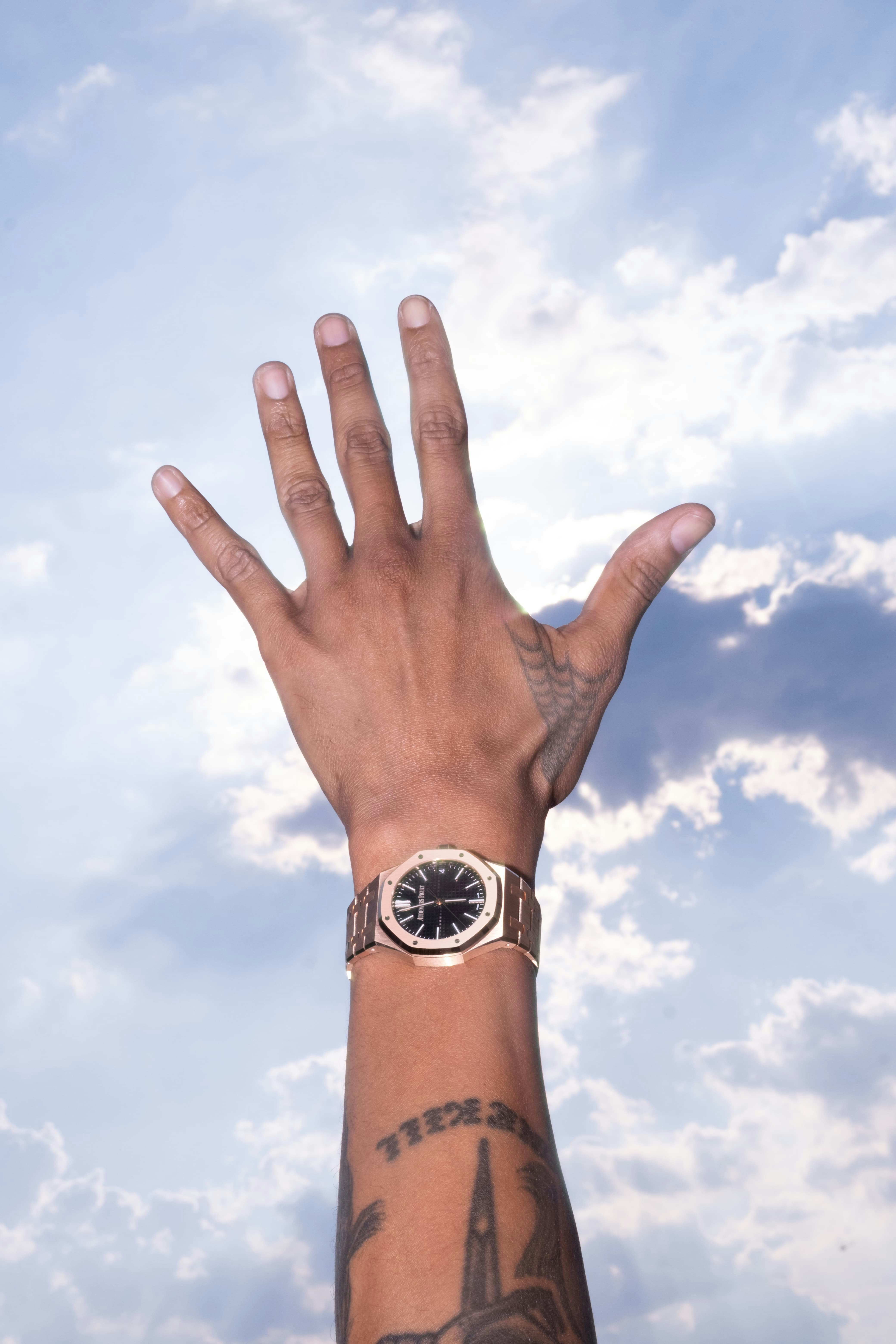
To celebrate the 50th anniversary of Audemars Piguet’s emblematic Royal Oak – an iconoclastic watch turned icon – we linked up with creative director Heron Preston for a conversation on creativity, foresight, and eschewing the “perfect plan.”
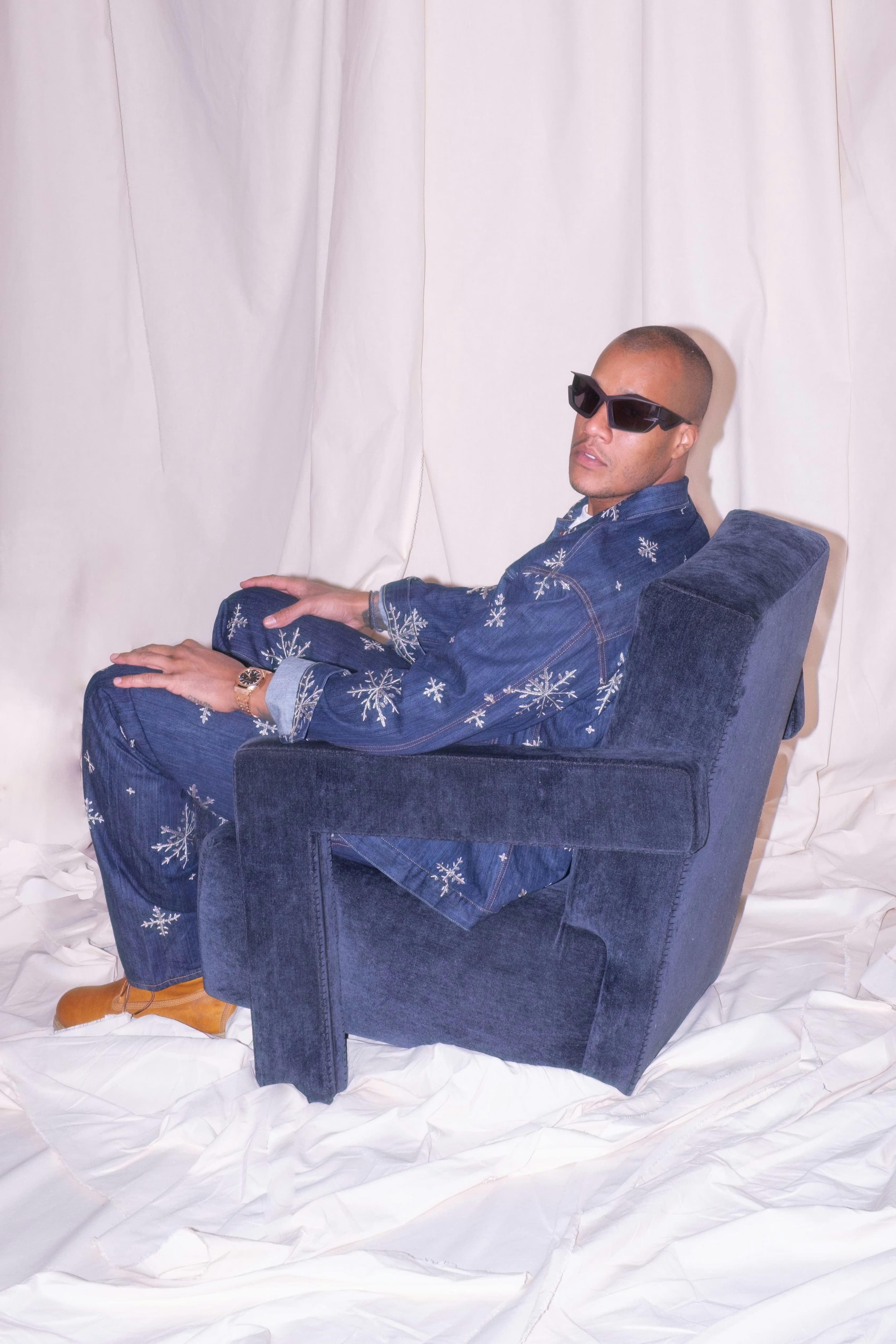
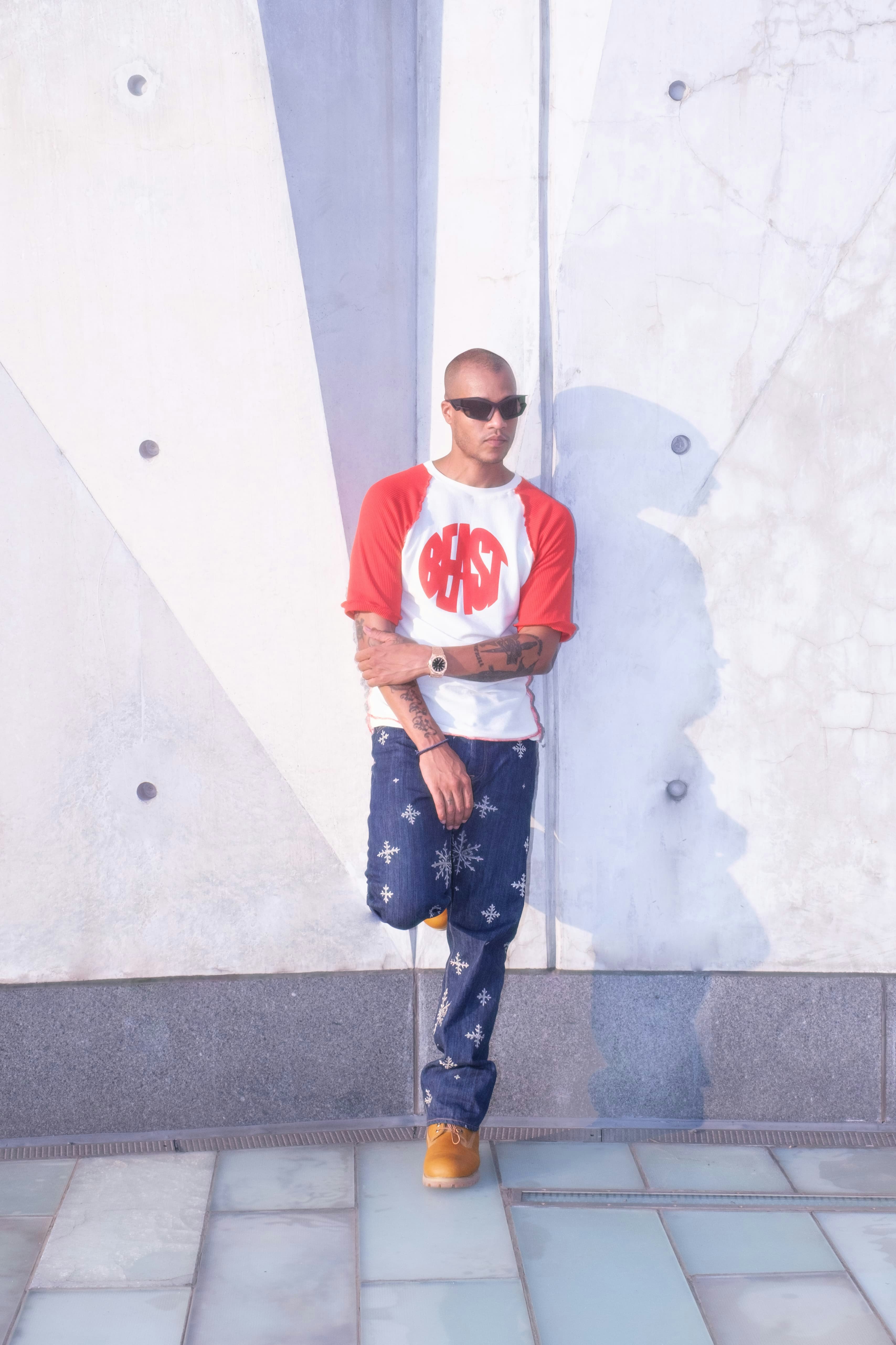
Not once, but several times, did Heron Preston find himself at the pulse of the zeitgeist, forging a new path in uncharted territories. In an era before Facebook, Preston was part of a pioneering generation of fashion bloggers, as he documented New York characters for his blog. With fellow blogger Virgil Abloh, they launched the cult streetwear label Been Trill in 2012, which also included Matthew Williams and Justin Saunders. At the urging of Abloh and Williams, Preston founded his own brand, which is easily identified by its shock of orange and its logo ”СТИЛЬ,” which is the word “style” in Cyrillic.
One of his most iconoclastic designs was also one of his first: the new uniforms for the Department of Sanitation in New York in 2016. By design, you couldn’t buy them at the stores, you had to work for the Department of Sanitation to get them. Suddenly, people employed in one of the city’s most vital, unglamorous, and under-appreciated sectors had fresh uniforms with newfound value. The project demonstrated Preston’s uncompromising approach to pursuing his own path, even if it explores domains not typically associated with high fashion. This acute curiosity and open-mindedness made Preston the visionary that he is today and the creator of some of the most disruptive designs of our time. Ones that have become icons of permanence in today’s world of perpetual obsolescence, just like the Royal Oak.
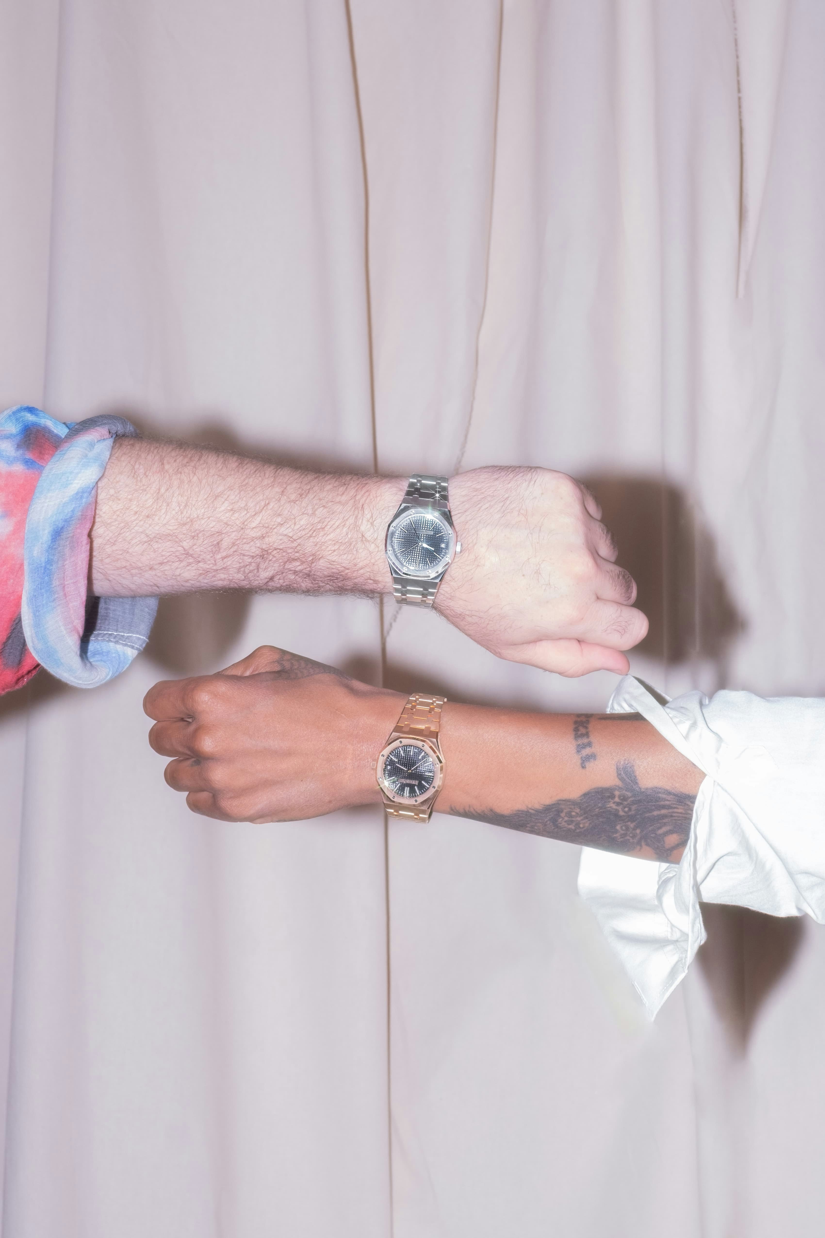
When it was created in 1972, the Royal Oak reinvented the codes of high-end watchmaking by fusing traditional savoir-faire with advanced technologies. Fifty years on, it has transcended the world of timekeeping to become a cultural artifact and a canvas for design innovation. In the words of editorial director Thom Bettridge, who bought his first watch, a Royal Oak: “What I loved most about the Royal Oak, and still do, is its brutality. This is a quality I admire across all forms of creativity because to be brutal is to sacrifice the polite comfort of the status quo in service of new ideas.”
As a fellow New Yorker, Royal Oak enthusiast, and a respected authority on modern-day culture, we invited Bettridge to interview Heron Preston on the occasion of the Royal Oak’s 50th anniversary. In an intimate conversation, they discuss finding inspiration in unexpected places, maintaining a free spirit, and the meaning of time in an age of impermanence.
Preston: When I had to get a passport, I noticed that I had a corrected version of my birth certificate, and I wondered why. I had to ask my parents, and my parents told me the story. They showed me the original birth certificate, and they misprinted my birth year as 1873. And I was like, Whoa, when I was born, I was instantly like a hundred and something years old. For a while, I was like a vampire. It was the first tattoo that I ever got: I tattooed 1873 and “mistakes are okay” on my arm. I applied that philosophy to my projects. It's okay to make mistakes. Mistakes are everything. There's this playfulness that comes from accepting mistakes. One of the first projects that I did was with a denim project where I purposely designed mistakes into the pieces where I would have mismatched rivets and reversed pockets and reversed belt loops and mismatched shapes of pockets. There's this element of surprise. I always like to tell the story about opening a pack of M&Ms and finding two M&Ms stuck together. That's incredibly rare... I think I even saw one being sold on eBay once.
Preston: Exactly. I did a whole factory defect project once. It was all about flipping a logo upside down, but all the other logos were right-side up. The idea was that, in screen printing, someone accidentally turned the screen upside down. They may have taken a lunch break and the machines were on auto, and they came back in the whole production run, everything looked correct, except for one logo that was upside down. I think that stuff is cool, and embracing and having fun with the factory defects, again, is something I like to integrate into design.

Heron Preston:
I break it up into phases. The first phase, I call the dream month. I give myself at least a month to just dream, study, look at the photos in my phone that I took over the past couple of months. I like to document the environments around me when I travel, interesting things I see, codes on how people style or how people dress. There are a lot of photos of people on the street, and then street signs or decals on trucks, weathering, sun-dyed awnings. Anything that I feel looks interesting. I'll just sit on those photos for a couple of months, but then, when it comes time to kick off the collections, I'll go back and I'll revisit all of those photos. And then I'll have conversations with my team about what's been happening in the world, what we notice, what we hate.
A lot of designs come out of wanting to inject some energy into things I’m frustrated or bored with, or things that are overlooked and unfamiliar. The idea is to be playful without any commercial pressure, or merch telling me what categories I need to fill. From that, we start to identify themes. And then, you layer in your pieces from your collections and see how they relate to the themes.

Preston: I spent a lot of time living in Chinatown, and the Lower East Side. So, a lot of the inspiration would come from downtown New York. But now, it's kind of wherever I'm at in the city. Also, because I would get haircuts in Harlem, I just love walking around 125th. No matter where I'm at, I can always see something that I might find interesting.
Preston: I remember coming to New York one of the first times, and wanting to stand outside just so I can hear that New York accent. It was almost the simple things that got me excited: Chinatown, dollar dumplings, the free talks I would go to at Parsons. I couldn't wait to walk down the street that was lined with brownstones. Going downtown and seeing skaters that I would only see in movies. Sneaking into fashion parties before I was even invited. I had a boss once who would only walk in the streets really fast because there were too many people on the sidewalks who would slow down his time. I learned a lot from just watching people. I was so green when I lived here. I didn't even know what green really meant when people called me green. I was curious to figure out how to make it in New York.
One particular memory is of a billboard on Bowery, I think, that said, “Where have all the junkies or the weirdos gone?” That's what made my New York special. I even made a yearbook out of this called “The Young and the Banging,” which looked at New York City as a high school. You could stay young forever in New York City. I noticed this at the restaurants I worked at, where I would work the late shift and people older than my parents would be coming to dinner at 11:00 or midnight. Back home, you would be in bed by then. In New York City, you can stay young forever.
Preston: It’s this two-way conversation. Adopting codes and integrating those into the collections is like a nod acknowledging the culture and environment around me. It's fun to incorporate those codes into the designs because it shows that I'm listening and I'm watching, and I'm having fun with it. With the Department of Sanitation work that I did, we acknowledged real human beings and the work that they do. I think what's cool about sanitation workers in New York City is that New York City is also a style capital. So they'll bring their swag to their uniforms, right? You might see them wearing skinny denim and some dope Timbs and how the denim stacks over the Timbs. Paint splats, all of a sudden, become a part of the uniform.

Preston: If you have dreams, time is precious. I have so many ideas I want to get out, and as the clock ticks, you start to realize that you don't have as much time anymore to get out all these ideas. I look at my work week, and I used to go hard all those days. When do I actually have time to do what I want to do? So now I look at blocking out Mondays and Fridays as much as I possibly can to have this space where my phone's not crazy, the emails aren't crazy. That brings me so much joy because there's this freedom that I've carved out for myself, and there's nothing better than being free, right? I started to embrace this in the past two years. Life was so fast, and then we had to pause—we all know why we had to pause—and all of a sudden, time changed. I began collecting vinyl again, getting into watches, and learning about stuff that I was always fascinated with, but I never gave myself the time. I feel like, in a way, when you start to give yourself some time, some space, you really start to love yourself.
Discover more about the Royal Oak's 50th anniversary.
audemarspiguet.comCredits
Director: Sondock
DP: Andrea Gavazzi
Photographer: Adam Powell
Executive Producer: Ivan Olita
Producer: Alex Advocaat
Production Company: Bravò
Editor: Chiao Chen
Color: Pasquinelli & Nat Tereshchenko (Of Ethos Studio)
Sound Design: Nikolay Antonov
Set Decorator: Emile Domise
Stylist: Bloody Osiris
Stylist Assist: Jasmine Morales
HMU: Tomoyo Shionome
Highsnobiety
Senior Producer: Rochelle Bambury
Creative Director: Sian O’Flaherty
Branded Producer: Chloe Snower
Talent Manager: Christian Grant-Fields
{"shouldDisplayHeader":true,"shouldDisplayArticleFooter":false,"shouldDisplayPresentedBy":false}